S.I.D
INTERACTIVE . PRODUCT DESIGN . UI . UX
The purpose of this project was to develop an interactive device that will enhance the shopping experience in Adidas Original stores. The device will be designed to make shopping and selling more enjoyable, easier, and fun for customers.
Functionality:
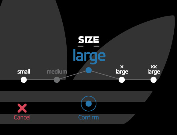
This product has a barcode reader, and when you get the device in front of a product, it could be easily identified. Then you can see the product price. If you confirm this, the next screen will be shown, which is the product different sizes. You can choose between the avail- able sizes and go to the next step. In this step the display screen will show you which fitting room you must go and how many people are ahead of you in a queue.
Why S.I.D?
For today demanding and tech-savvy purchaser, stores need to make shopping easy and enjoyable from every facet.
Stimulating the senses and engaging the emotions become increasingly important and to achieve these goals, they must get help from a range of methods and rules such as interactive design, making experience, personalization, customer convenience and so on. This project started with a focus on store design with a digital mindset, with an emphasis on two parameters: making experience and customer convenience.
Stimulating the senses and engaging the emotions become increasingly important and to achieve these goals, they must get help from a range of methods and rules such as interactive design, making experience, personalization, customer convenience and so on. This project started with a focus on store design with a digital mindset, with an emphasis on two parameters: making experience and customer convenience.
Ergonomy:
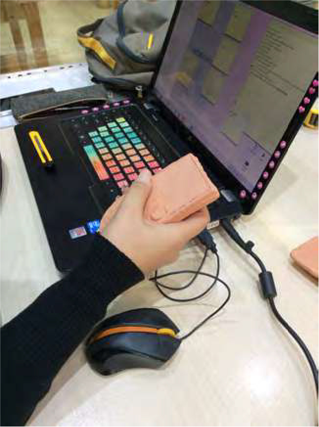
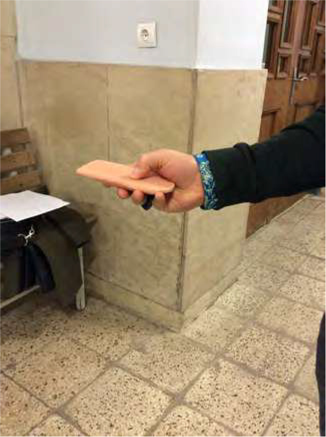
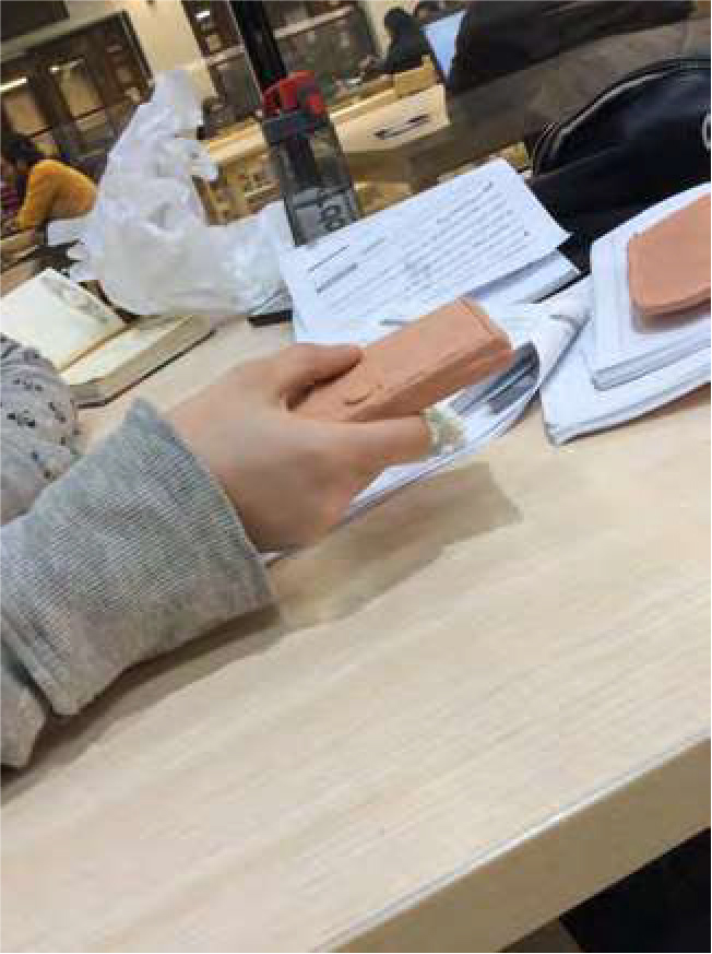
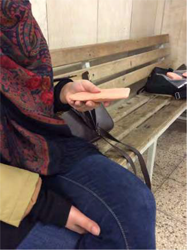
In order to be sure about the ergonomy of the product i made a prototype and gave it to people to receive feedbacks and see if its convenient enough or not.
User Interface:



How it works:
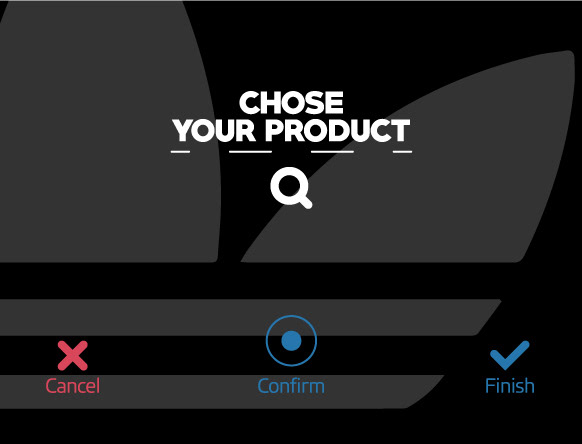
Step 1: you can see the product price. Then you can confirm it and go to the next step or you can cancel the process and choose another product
This project started with a focus on store design with a digital mindset, with an emphasis on two parameters: making experience and customer convenience.
This project started with a focus on store design with a digital mindset, with an emphasis on two parameters: making experience and customer convenience.
Step 2: you can see all sizes of the product and choose from the available ones. Once you confirm your desirable size, the product will be added to your shopping basket.
Step3: once you are done with choosing the product, you can press the DONE button and the display screen will show you which fitting room you must go and how many people are ahead of you in queue.
